By Vannie Gama.
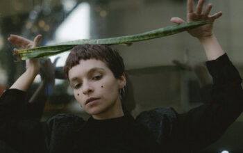
As I prepare for the group exhibition at Maison France–Montréal on January 31, featuring the ‘Gestes’ trilogy from November 2025, here in Montréal, I realized that this month there were three older works on paper included in Tableau’s January Auction Catalogue. In addition to last year’s paintings—very recent fragments that appeared in the 2024 catalogue, Handbook—there are now two portraits and a woodcut. Although extremely different from the ‘Gestes’ series, one of these works shares something with it: the use of proportion and the compositional language of portraiture. In this text, I will focus on commenting both on the works available in that catalogue and on some reflections about paper-based techniques, as well as their contexts and, for readers who enjoy random stories, a few rather specific circumstances will be also shared.
I like words that are used with a sense of absolutism that could not be more fragile in their social, technical, and etymological history, or even in the emotional dimension of their use. Drawing is one of those words that carries an apparently resolute contemporary meaning, whose separation from the order of painting would be equally precise. What is a drawing? In the world of signs and symbolic stereotypes, it is possible that the reader’s answer silently appears as the image of a sheet of paper and a pencil, or a sheet of paper and a pen. It was probably a black‑and‑white thought for adults and a colored one for children; generational sobriety among Millennials and earlier generations. Now, drawing for Generation Alpha and part of Generation Z may have other, digital symbols. Evidently, this imaginary would only work when we specify “to draw” as an action and result, or something of that sort, since Drawing as a noun in an independent and imperative form, without an article, can evoke more complex forms such as comics, magazines, animations (in certain languages and cultures).
And when we ask, what is a painting? Again, in a contemporary imaginary, there is still the forging of the aura of art and its icons, and perhaps there is no naming of material, but of result: paint on canvas is not the easiest of images to be captured. Here, we often already evoke the image of the artist with a palette, with brush and canvas, or, simply, in the West, the Mona Lisa, or any painting with a heavy classical frame. Certainly, just like drawing, a painting, without the weight of art, is vastly broader in imaginary: the painting of a house with gallons of paint, the painting of any material, since the act of painting is much more the “covering of something.”
Well, and then what happens when we paint on paper? If we reduce our scenarios to more pragmatic actions, painting is the act of using a brush, while drawing is the use of a pencil, a pen, in short, a more modern and synthetic object. If we paint on paper, would we have a painting? If the answer is yes, we would need to assume that drawing is reduced to the material used on the paper. Well, the problem is that this is not true: if I show any image that carries a composition resembling the controlled path of a drawing, the person will assume it is a drawing, even if it is a painting. Illustrations on paper are a major example of this. Another fact is that drawing is not a technique subordinated to paper: if, when I asked what a drawing is, you imagined yourself marking a sidewalk with chalk or with a piece of brick, for instance, your imagination proposes a drawing, even if outside the base of the sheet. Even the sheet itself may be composed of the same material as a canvas, only treated differently and thus embodying a rigidity closer to the idea of industrial paper cellulose than to the fabric of a canvas stretched on a frame.
And what about graffiti? Graffiti does not use either of these two tools in a final way. Spray cans leave traces, but they fill spaces. The final result can be free like a painting or well‑outlined like a drawing. The support, the wall, vertically and proportionally, generally larger than the artist, requires a specific kind of appreciation, like that of a movie screen or the chapel of a church. I like these mundane examples, without the theoretical weight or the verbose language I use in academic and scientific texts, precisely to bring you to a more careful look at false canons and linguistic habits. It is not, moreover, a problem for which we must find a solution. But we can indeed think about language games and alternatives that, like a vocabulary, are concerned with diversifying the description of the medium, enriching our empirical perception.
If we were to pause and trace a historical trajectory, from the mural art of the caves of our distant ancestors, to African papyri, to Chinese scrolls, we would already encounter a mixture between the sober record of drawing and the interventions of painting, which, in any case, are two‑dimensional pictorial expressions, and for me personally it is a far more complex matter to create or propose any “objective” separation between both forms of visual impression. Impression in the sense of leaving an imprint, a suggestion, a perception of something. The fashion of the word drawing is much more, historically, associated with the Renaissance and the fine arts academies, as a technique of study and planning, in the service of the final art, whether architectural, engineering, natural sciences, painting, fashion, routes and cartographies, and so on.
Presenting this problem to you, and without any solution, I will from now on share a rather relaxed opinion, without relying on any bibliography. Much more oriented toward my artistic experience and my study of art, to continue this text, and with almost complete sincerity, I say that some of the works presented here are in fact works of art, while others are merely scribbles, sketches, and finally, creations on paper using different techniques, some drawings, others woodcuts, and others that I consider drawing even with the use of a brush. In any case, the point is that drawing is not and has never been my primary medium; however, it is an unavoidable and inseparable technique in the translation between the world of ideas and materiality. Every good artist possesses a good drawing, for drawing is the structure of any materialization, and the concept of sketch can be freed not only from paper and pen, but from pictoriality itself. Drawing is structure, perceptible through the figurative in the visual arts or completely hidden in the unconscious, or in the immediate rhythm of calculations that create “truly” abstract works.
I was never a great artist of drawing, although I consider myself a good painter and an adequate, mediocre drawer who manages to build a structure. The very act of drawing is to understand drawing either in the world of ideas or, when we study, the drawing present in the nature of things — in materiality. Whether for presentation or representation, drawing generally requires efficiency in transmitting the symbolic message we want to convey, and this achievement is extremely technical and complex to reach. For example: the art of portraiture, or the figurative that seeks to bring more than two dimensions into drawing (as in the drawing of a glass with depth and transparency), is much more than “mimesis” (copying), but is precisely the understanding of the structure of the object or of existence in order to make it efficient in its task of being recognizable. The abstraction of representation, or the authenticity of presentation, are even more demanding of technical skill, because beyond the analyzable repertoire, there is the creation of structure.
During bachelor years, I was required to draw a great deal. As I have mentioned in other texts, I had an excellent mentor and drawing professor at the University. She knew precisely how to guide us between grasping the general form of the world and tuning our adaptation to variations of representation, letting go of technical imposition on the medium and learning to articulate the needs of transforming ideas in relation to the instruments and space used. I also had good teachers of woodcut, screen printing, and variations of traditional graphic arts techniques. I was never good at any technique of precision, perhaps reflecting not only my inability to commit technically to the procedural tedium that overwhelmed me during my undergraduate years: screen printing and analog photography, for example, although techniques whose results always surprised me when coming from skilled classmates, professors, or artists we studied, were, when I had to do them, a true nightmare because of the endless number of steps required to achieve a given result. This immediacy also did not suit oil painting, which led me to develop drying techniques and layered compositions that diverged from theory and from classical techniques.
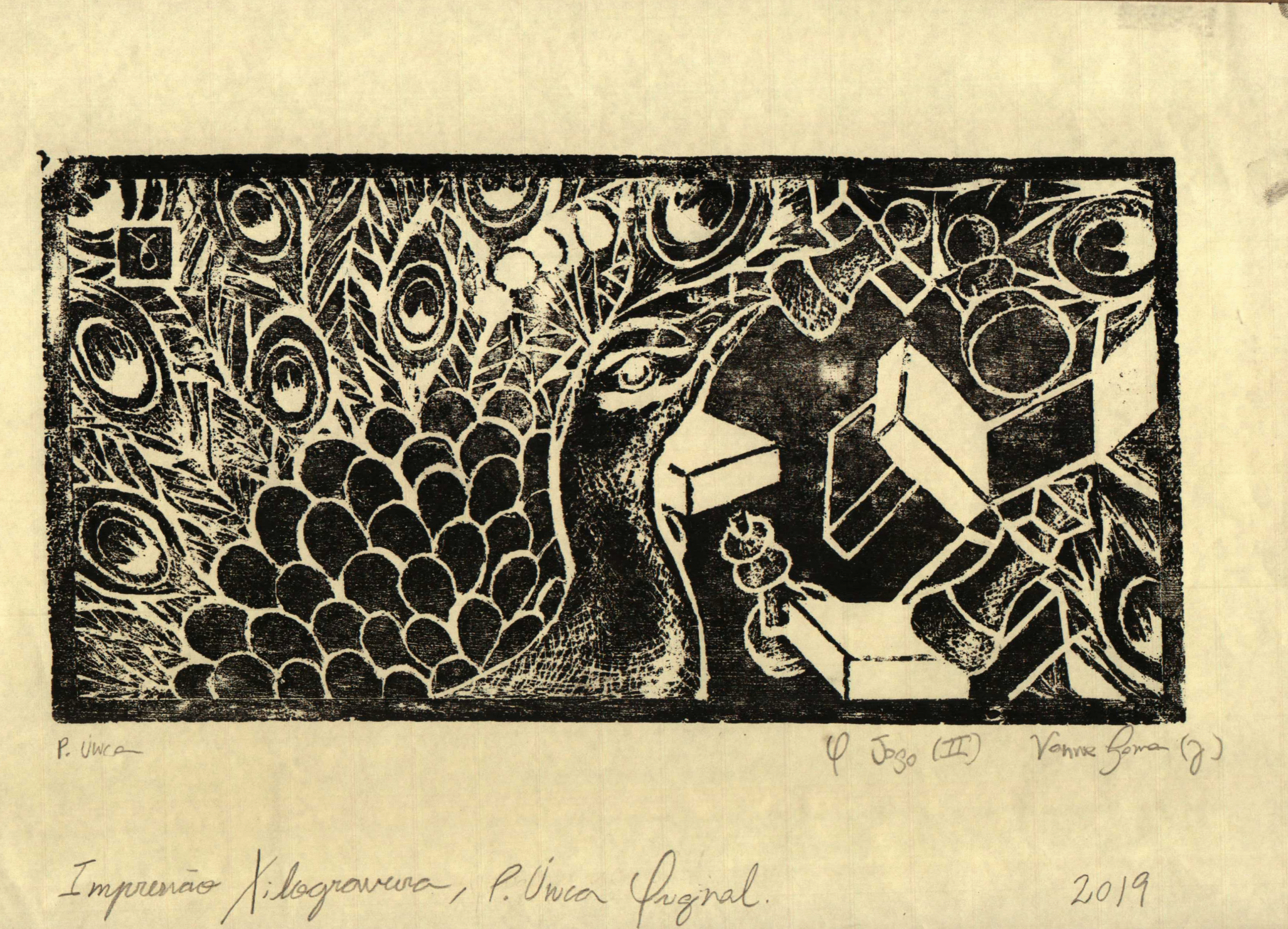
My first woodcut was “O Jogo,” version 1, from 2019. Our professor at the time was a young artist (then around 27 years old) whose main technique was woodcut. Her knowledge of assessing the conditions of the wood far more than an excessive concern with the instrument was typical of when an artist is close to or reaches mastery of a given technique, understanding that the most efficient methods usually reside in the surface and in the composition, and that any instrument that fulfills the function of translating a given objective (even if this is “instantaneous” and intuitive creation) is welcome, breaking away from the myth that it is the quality of the “textbook” instrument that will provide the technical result. New techniques are necessarily developed through this detachment, through the insufficiency observed between instrument and working surface or working object.
Well then, she taught us, from the beginning, to use box cutters and knives in case we did not adapt to regular gouges. At that time, I was obsessed with peacocks, and it was not for a reason such as studying the species or cultural studies — where the peacock has strong mythological correspondences and all that. The point is that that year I had taken a trip to Switzerland, and on the plane I met a Brazilian‑Norwegian woman, a model, who spent part of the trip telling me how the place where she lived had peacocks like pigeons: there was this café she frequented where the peacocks flew over the tables and around the establishment.
On that trip, she was seated next to me, and beside her was a young man from Rio who was going to visit his Dutch girlfriend. Both around 18 or 19 years old, they ended up kissing on the plane, and I, thinking about how surreal it was to imagine peacocks as pigeons, avoided looking at the two of them entwined, considering that the young man had a monogamous relationship with the Dutch young woman whom he saw twice a year. The Brazilian‑Norwegian girl showed me photos of the place with the peacocks, and it became an animal I began to particularly appreciate that year. As for chess, well, it is no surprise that it is one of my favorite games, and one of the favorite metaphors for scholars of linguistics, semiotics, mathematics, and physics, a rather common cliché obsession.
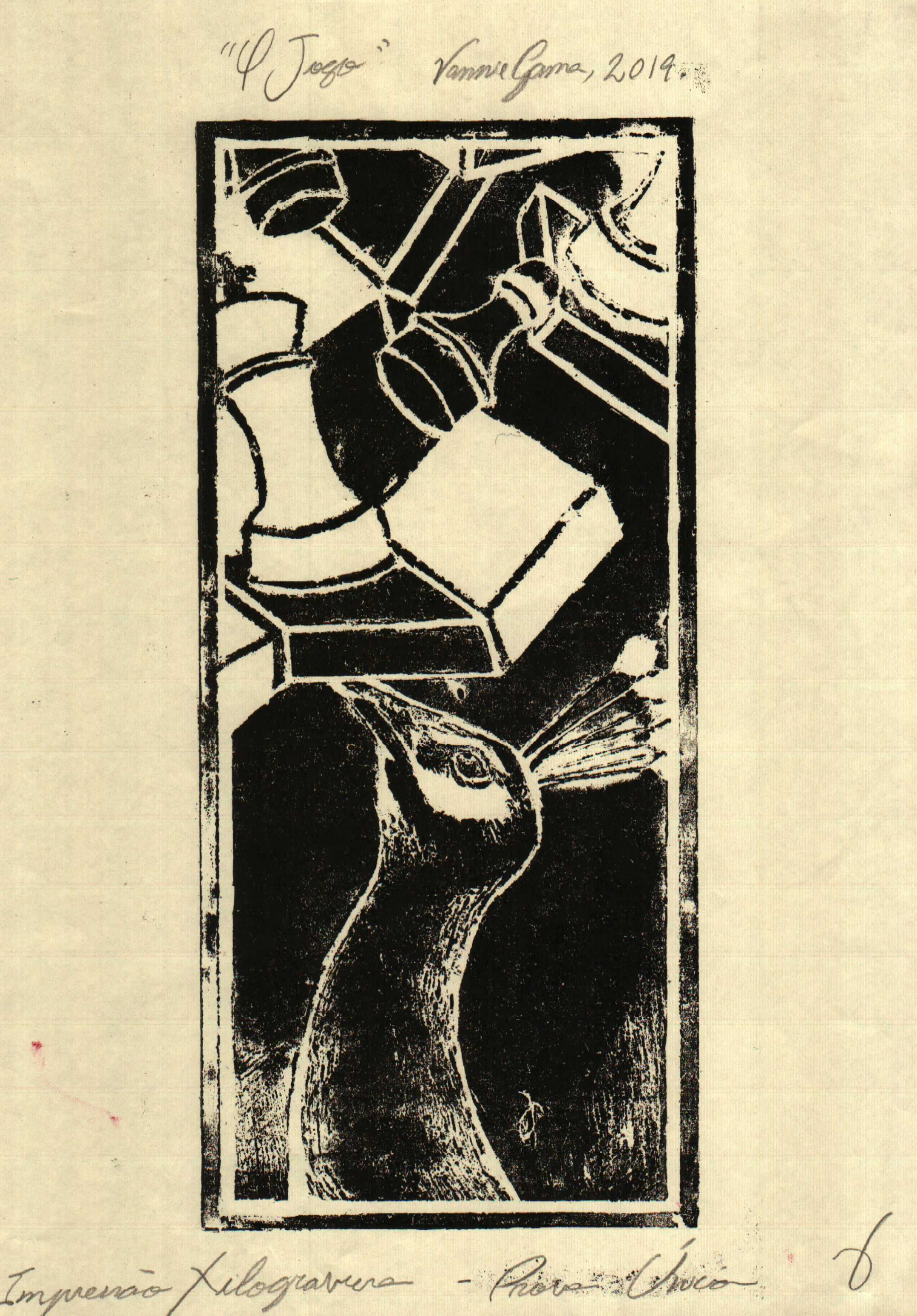
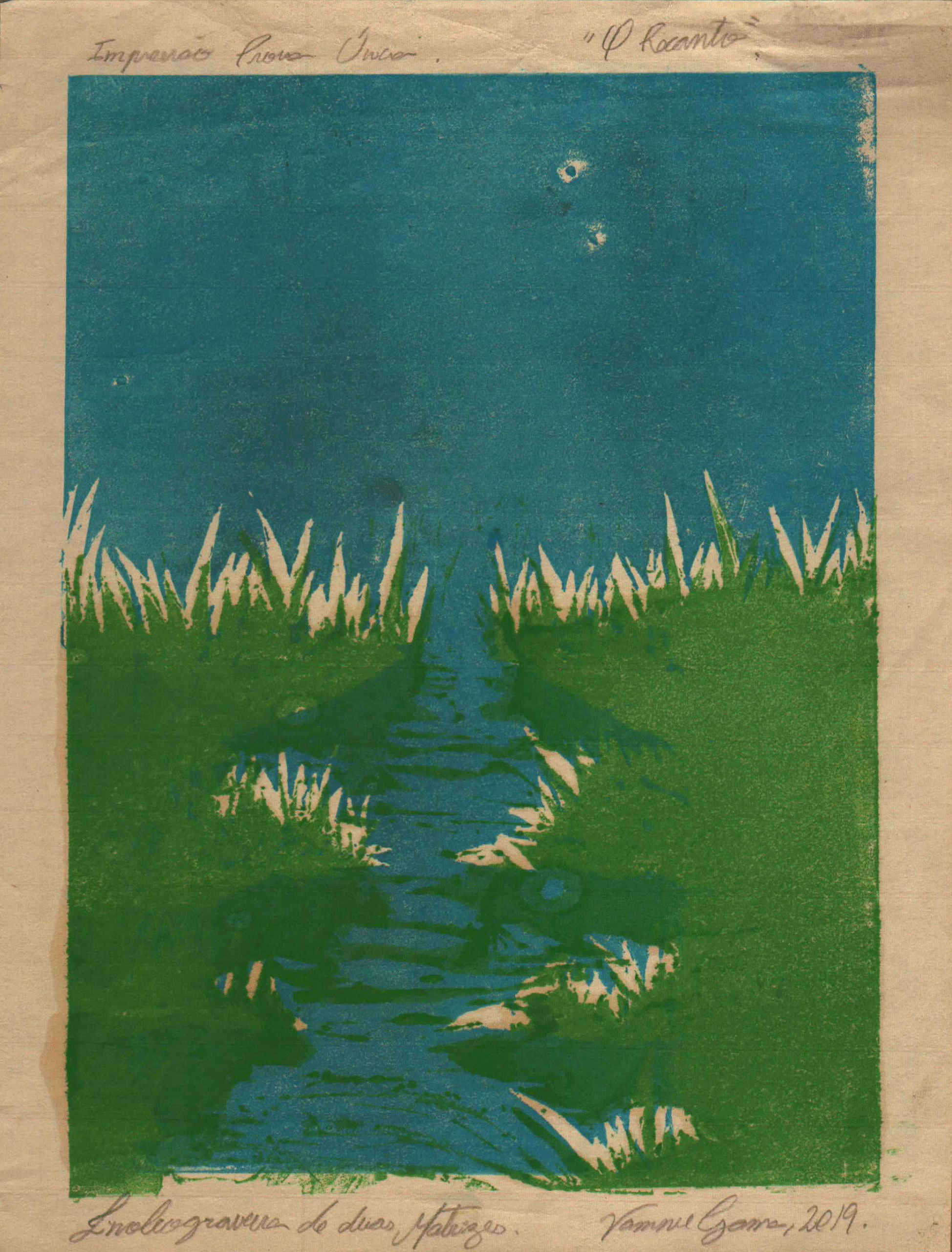
The prints of “O Jogo” (version 1) turned out horrendous. We made the prints with a wooden spoon over the delicate paper in contact with our wooden blocks. While my classmates produced perfect prints, I ruined a reasonable drawing with a terrible transition into what, for many, is neither drawing nor painting. After that block, we also had classes with other matrices and possibilities of chromatic composition with the blocks, as in screen printing, such as in “O recanto,” from the same year. Still in 2019, I did something for the first time: rework an idea. “O Jogo” received a second version, much more elaborate in terms of carving, yet still with terrible prints.
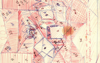
I do not usually rework ideas, because honestly, when they are not well executed, I tend to assume that the problem lies in the idea much more than in the form, and since I have many ideas, I prefer to give the chance of “something less mediocre” to new possibilities rather than try to repair the translation of the imaginary or of the conceptual‑visual. Perhaps it is simply a matter of never having had an idea “good enough” that failed so miserably as to deserve a new period of work; generally, I make sure that the result will not be so depressing precisely because of the long time of creation and planning that precedes the final form of my works. For example, several ideas take me years to realize even once, because I know that when I have them, I am not ready for the undertaking of structuring and creating them decently. The installation “Mutualismos Eternos” from 2023, the painting “Espelhos de Gaia,” and the Astropoética drawing series are visual examples, while theoretical examples are, well, all of them, with the exception of the academic compass — when I am required to write something in a few months between the idea, the structure, and the research.
The experience of woodcut, aside from the printing itself, was quite constructive, and it was a technique through which I understood why it had been so indispensable in the history of art, even without having had experience with what is perhaps the most “famous” language, lithography. This one seemed to me very tied to the principles of technical drawing, a discipline I always avoided even though I knew I needed to make peace with it. There was another drawing technique that, unlike lithography, was “natural” to me, which is portraiture. It took me a long time, however, to bring that to the canvas, because the speed of a sketch on paper captures moments unpretentiously, in comparison to the less negotiable rigidity of “more figurative” oil painting. It was during university that I developed the habit of drawing friends, boyfriends, girlfriends, experimenting with different materials.
In the sketch above, there is the technique of hatching with an ink pen, and below, the drawing of a university colleague, Camille, who at the time was studying journalism. For Camille, I used a pastel stick I had received as a gift from a former boyfriend who studied design, and at the university where he studied, they had a class on making pastels, and as a gift, he gave me this box with six colors he had created himself. This box stayed with me for at least eight years, long after we had become just friends, and I only parted with it when I was forced to donate it when I immigrated to Canada last year. I never again found a blue with that tone between an ultramarine and a mixed viridian green.
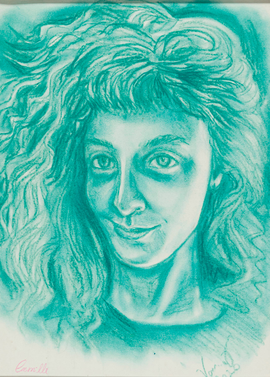
Generally, the choice of portraits was quite organic: people whose features I found beautiful, close friends in the midst of bar tables or gatherings at home, lovers who were also artists. I also drew many family members, especially the older ones, when I visited them in the countryside and we spent the afternoons at a table with coffee and homemade cake. Camille was not a close friend, but someone who had beautiful features at the time: enormous green eyes and wavy brown hair that framed her lovely nose.
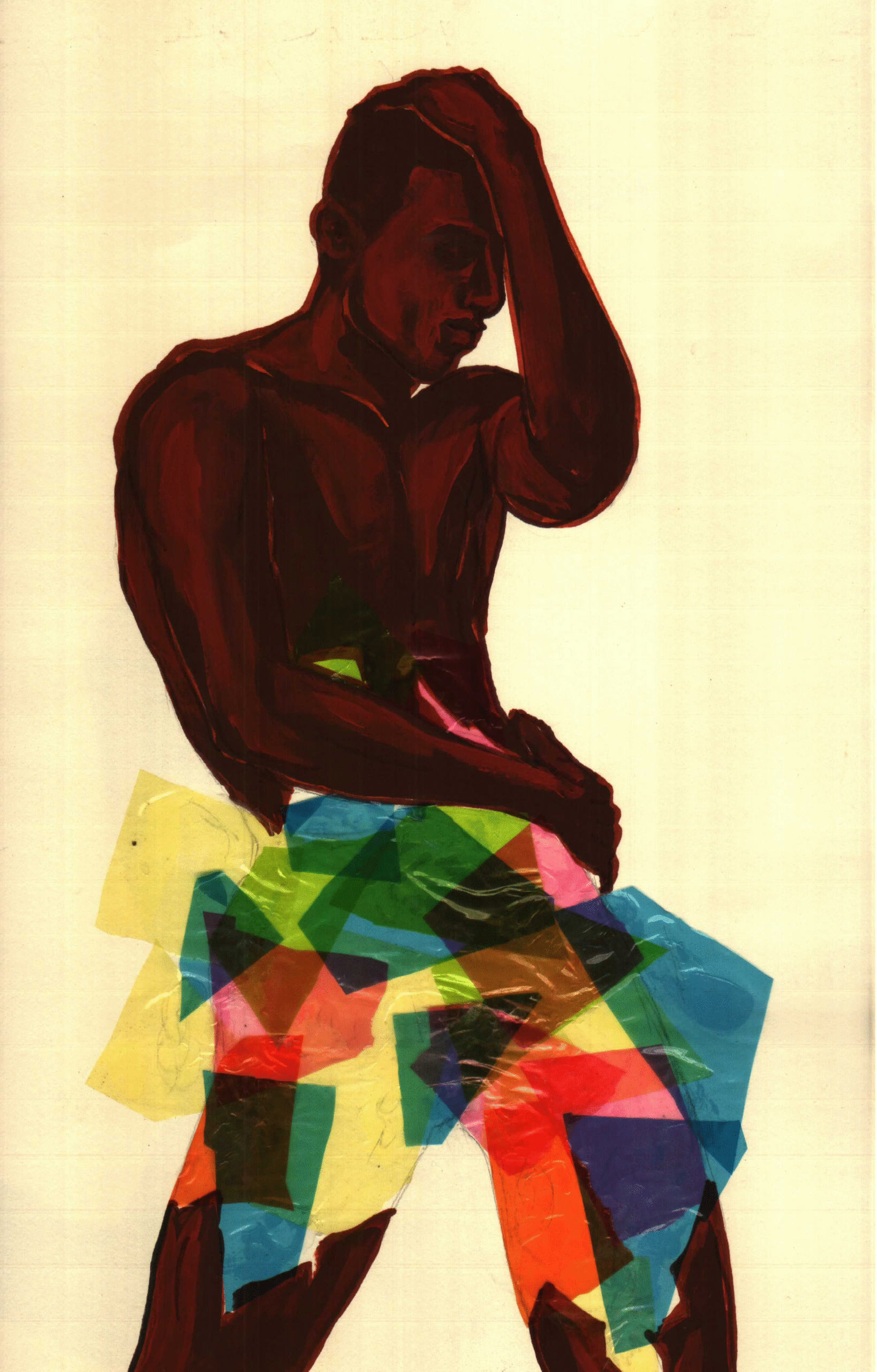
Among the portraits there were paintings and other experimentations, such as the only series on paper I have made to this day (literally, since in 2025 I began the “Astropoética” series, but we can then say that I went a good few years without making series “on paper”) with the human figure, which was the quartet “Meanwhile, he dances,” portraying the dancer and friend Ruan Galdino. The series of A2 boards were acrylic paintings with cellophane interventions, three of which today belong to a dear collector, and the fourth was sold in some previous Tableau auction. I consider the boards of “Meanwhile, he dances” one of my most relevant series so far, in 2026. “Meanwhile” refers to the period we were living at that time in 2020: the Covid‑19 pandemic and the social struggles in which the artistic community remained engaged alongside the people.
One of the exercises we did during university, going back to the years before 2020 (the year I officially graduated from UNESP), was to draw with a minimal amount of time, which contradicts most drawing methods in fine arts schools, where long sessions are held in search of mimetic or deep apprehension of the observed form. In these classes, we alternated between long and very short sessions, between one hour and five minutes. It was in these sessions that I met two, at the time, dear friends and, in a way, indirect mentors — given the importance they had in my life — who worked as freelance life models at the university. The two were directors, an actress and an actor, from a contemporary theater in the city. It was there that I discovered performance, a language that would become one of my greatest sources of inspiration, admiration, and attention, alongside music and, in a third instance, cinema.
Returning to the pandemic, I graduated in January 2020. The Covid‑19 crisis was being reported as something that “might require a quarantine.” Things were developing quickly, and at the time, fortunately, I was living with an old close friend, a chef. The two of us were extremely irresponsible with our lives. I, more than her, for being younger. During the pandemic, in the heat of the Brazilian summer, we found ourselves caged in, with our lives interrupted. My parents were furious with my request to wait for the pandemic to pass before moving forward with my professional plans. The fact is that the cultural world was freezing at the speed with which a mammal is frozen in extreme temperatures, and there was nowhere for us to warm ourselves there. Well‑established professionals were losing their jobs and their clients, and we, newly graduated students, completely unestablished professionals who would already have had difficulties entering the market in any case, were still caught by the absence of a cultural market — or its paralysis, containment, and reduction as if by a sudden dehydration.
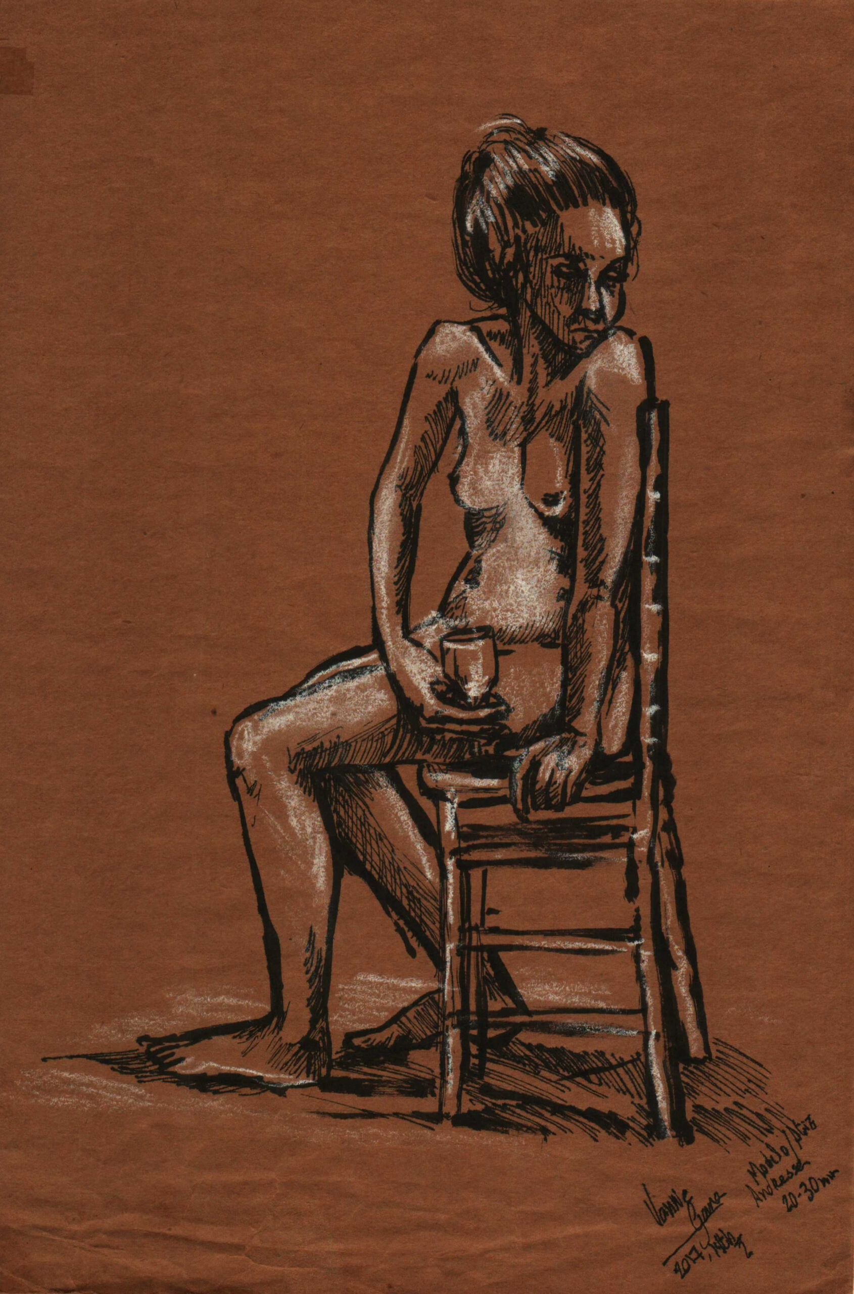
It was on one of those afternoons of hopelessness, when I set myself to at least keep creating while planning my move out of that shared apartment, that I drew two boards of my friend, who, unlike me, handled the situation much better. Sitting on our couch in the living room, in her usual shorts and fresh from a cold shower, we gossiped while she talked to some of her various contacts from that time. I remember having enormous difficulty drawing her hands, since she typed nonstop — even to distract herself from being a model there, for free.
At the time, she did not like the drawings, understandably. I did not retouch any of the “imperfections” of those natural poses, and in the moment of drawing, I was not focused on making her look like a muse, but, as always, it was a fraternal form of affection and release, portraying the dear people around me. To me, she was beautiful in any pose, without the need for any editing for a given objective.
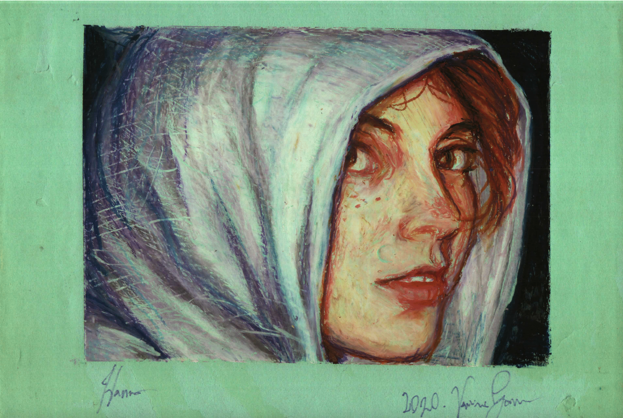
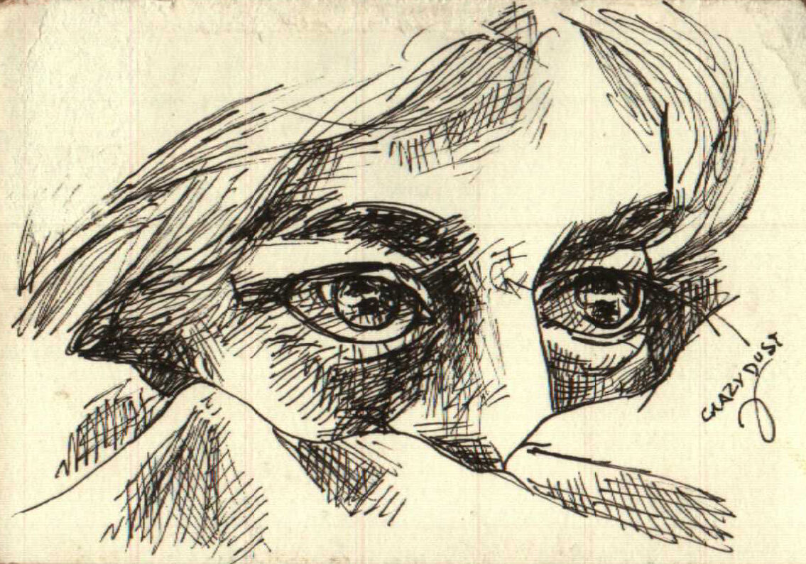
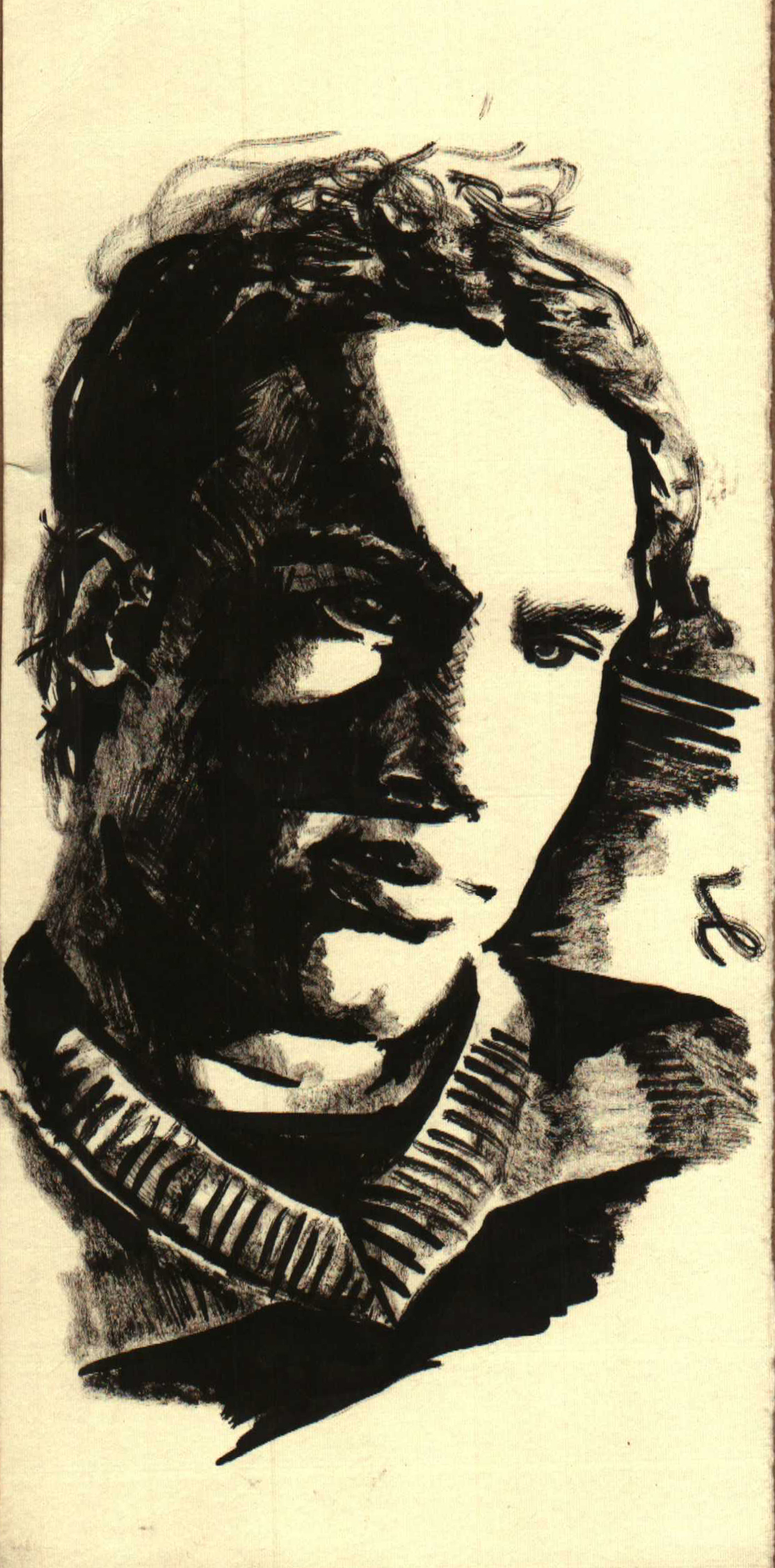
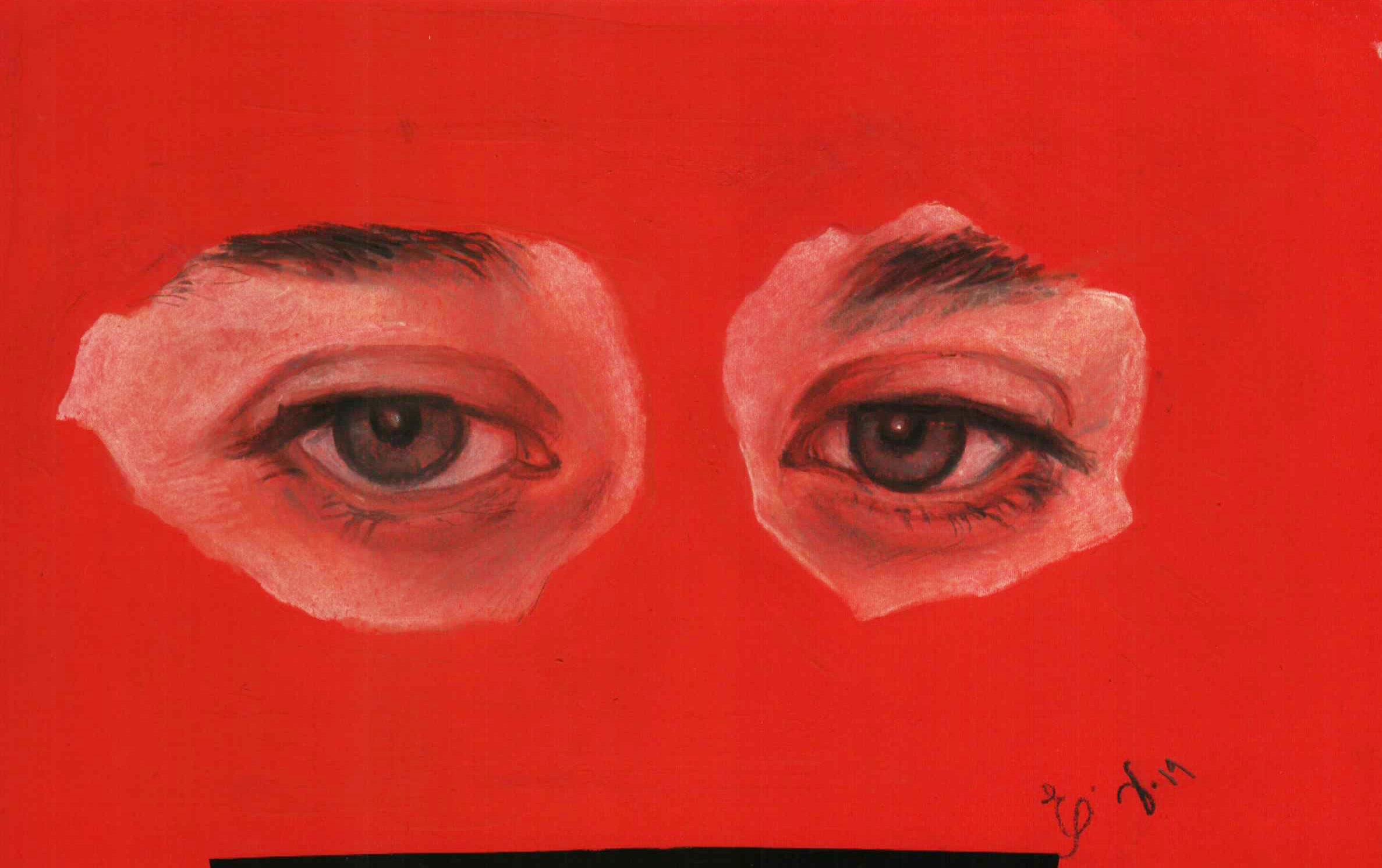
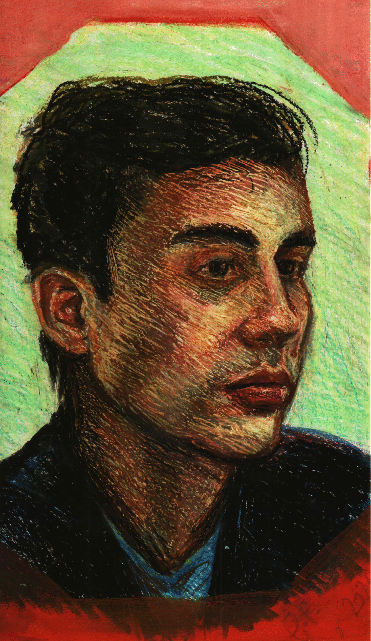
Other techniques I explored at that time were oil pastel, as in “Hanna” (a designer), and in the pair of eyes on red paper, of a journalist and translator friend from that period, as well as the technique of self‑contrast with ink, as in the portrait of a painter and draftsman friend below. All these works, unlike the series “Meanwhile he dances,” are small, ranging from 10 × 10 cm to 40 × 30 cm.
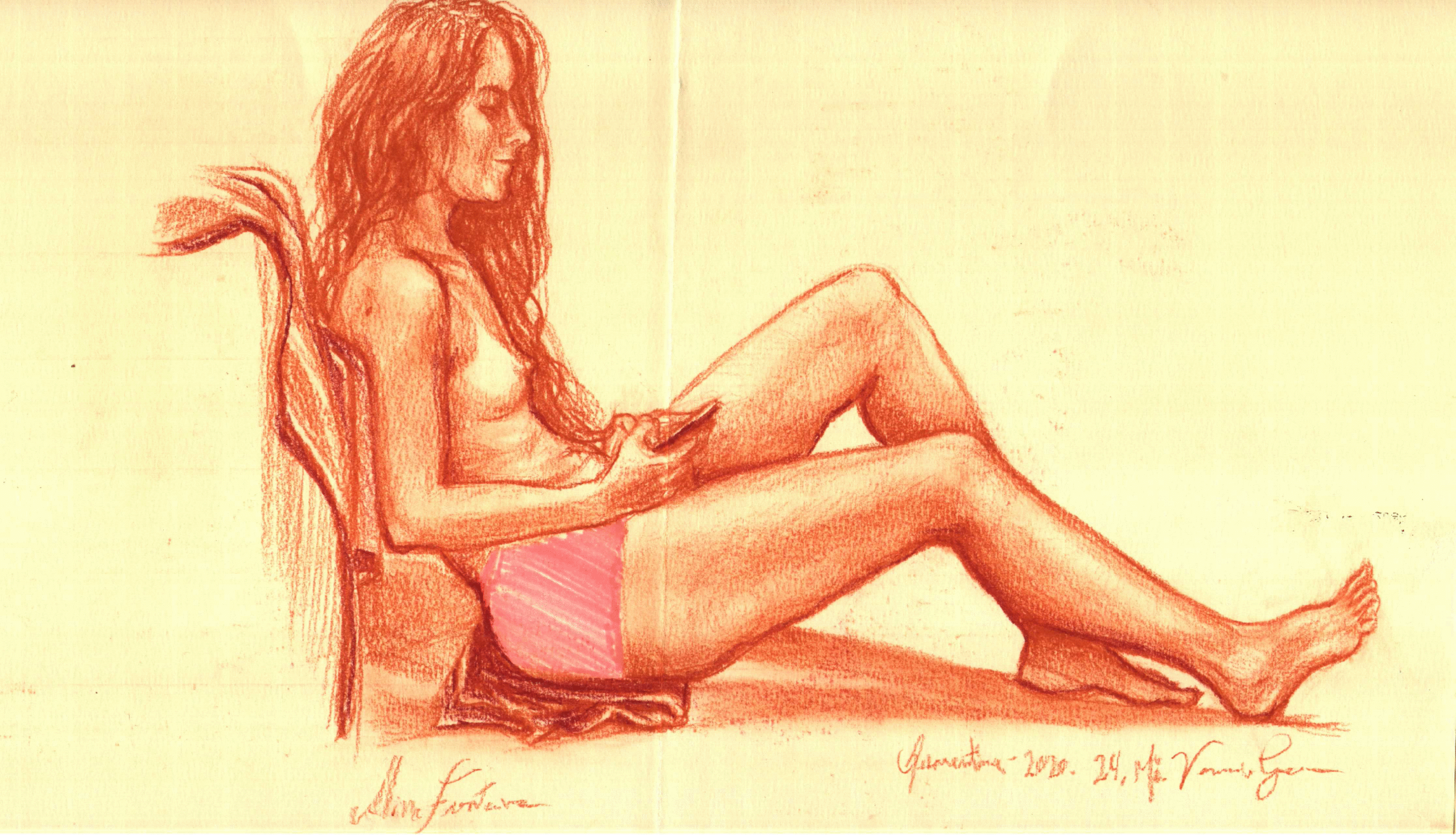
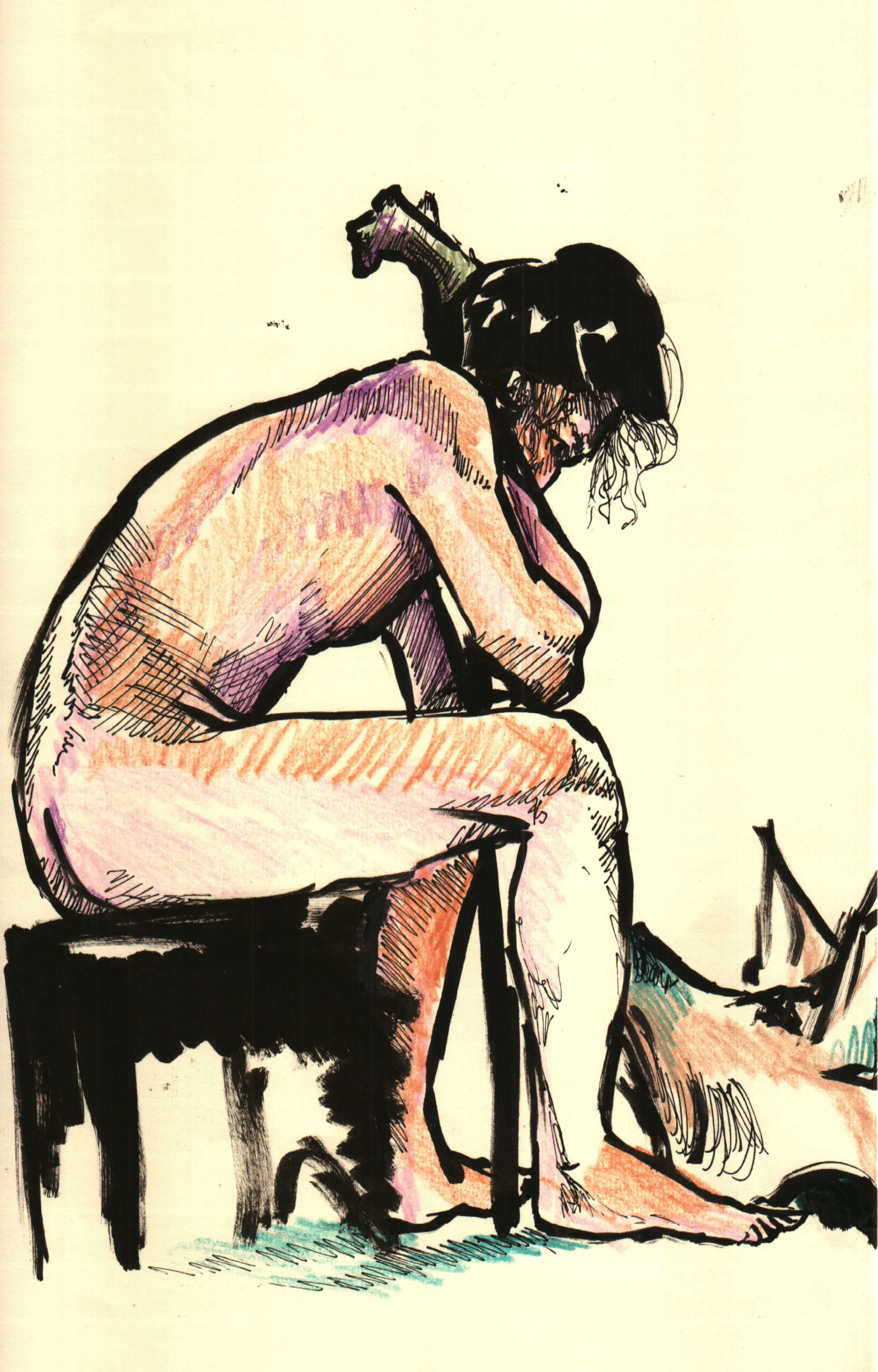
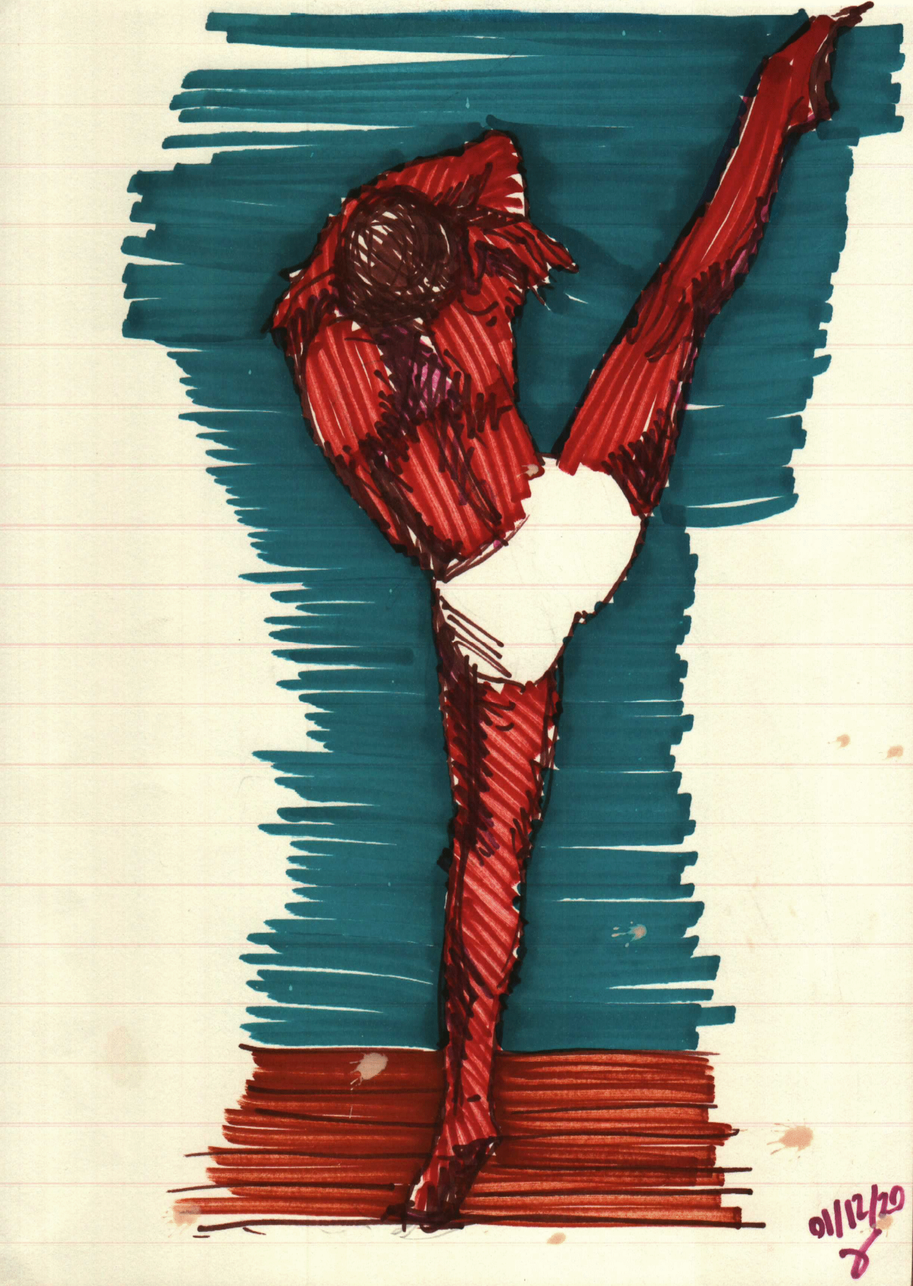
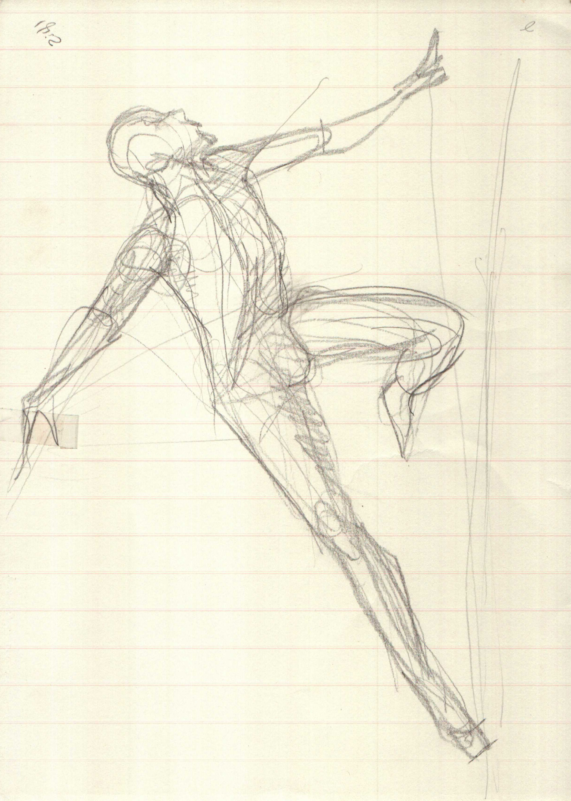
The freedom that drawing can offer, unlike technical drawing, lies perhaps precisely in the agility of using different materials on the page, which I personally find difficult to achieve in other media. The calibration of the paper or smooth surface accommodates both dry and wet techniques without compromising the final result, as visible in several of the works shared in this text, including the board below, which mixes wax crayon and ink, portraying an actor, and in the portrait after it, portraying a poet, this one made with wax crayon and acrylic paint on the sides. The use of accessible materials in drawing, as in almost any other medium, also allows for the expansion of experimentation, in contrast with the “more formal” painting (on canvas), as in the sketch of a dancer following the portrait of the poet.
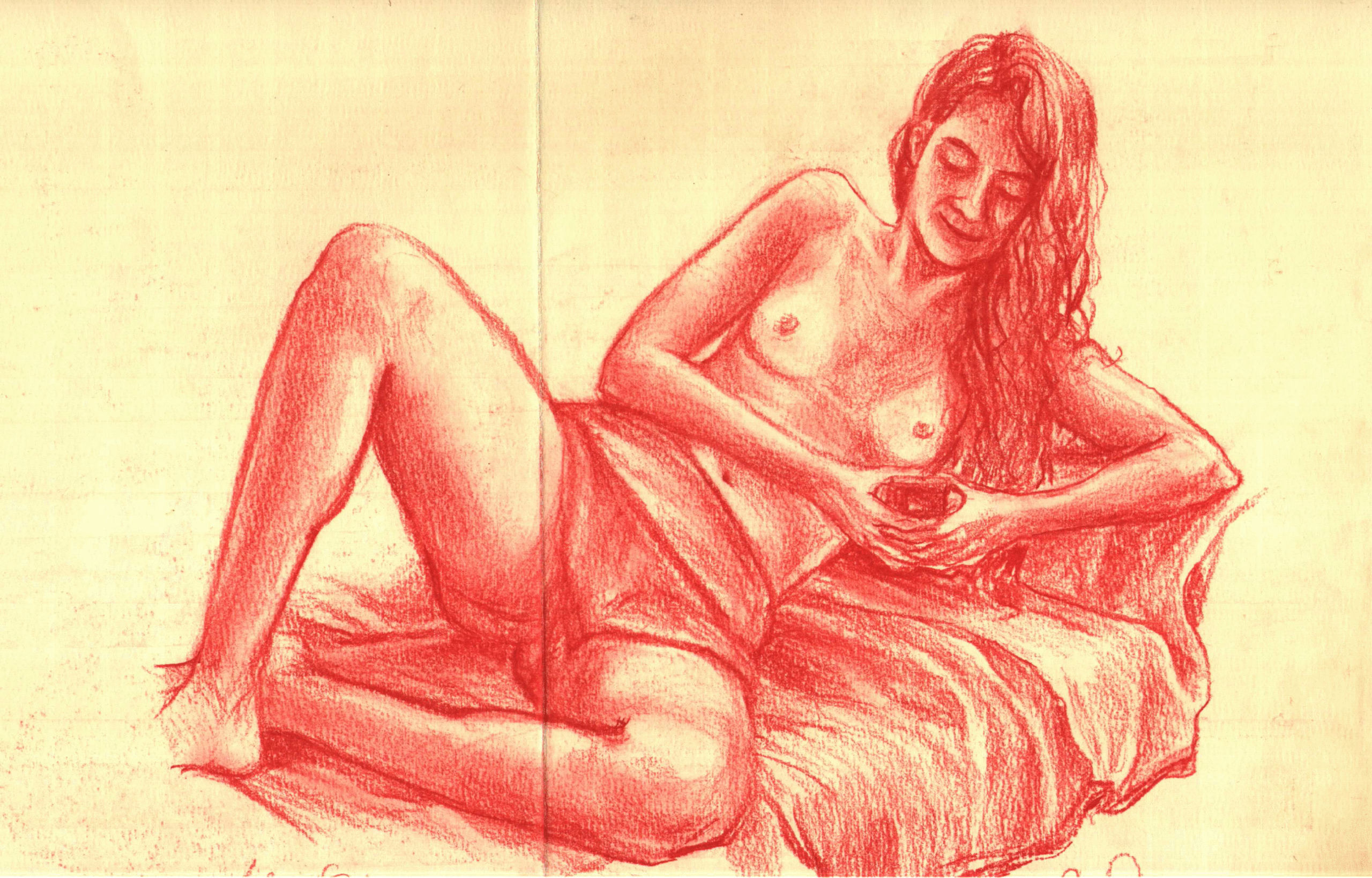
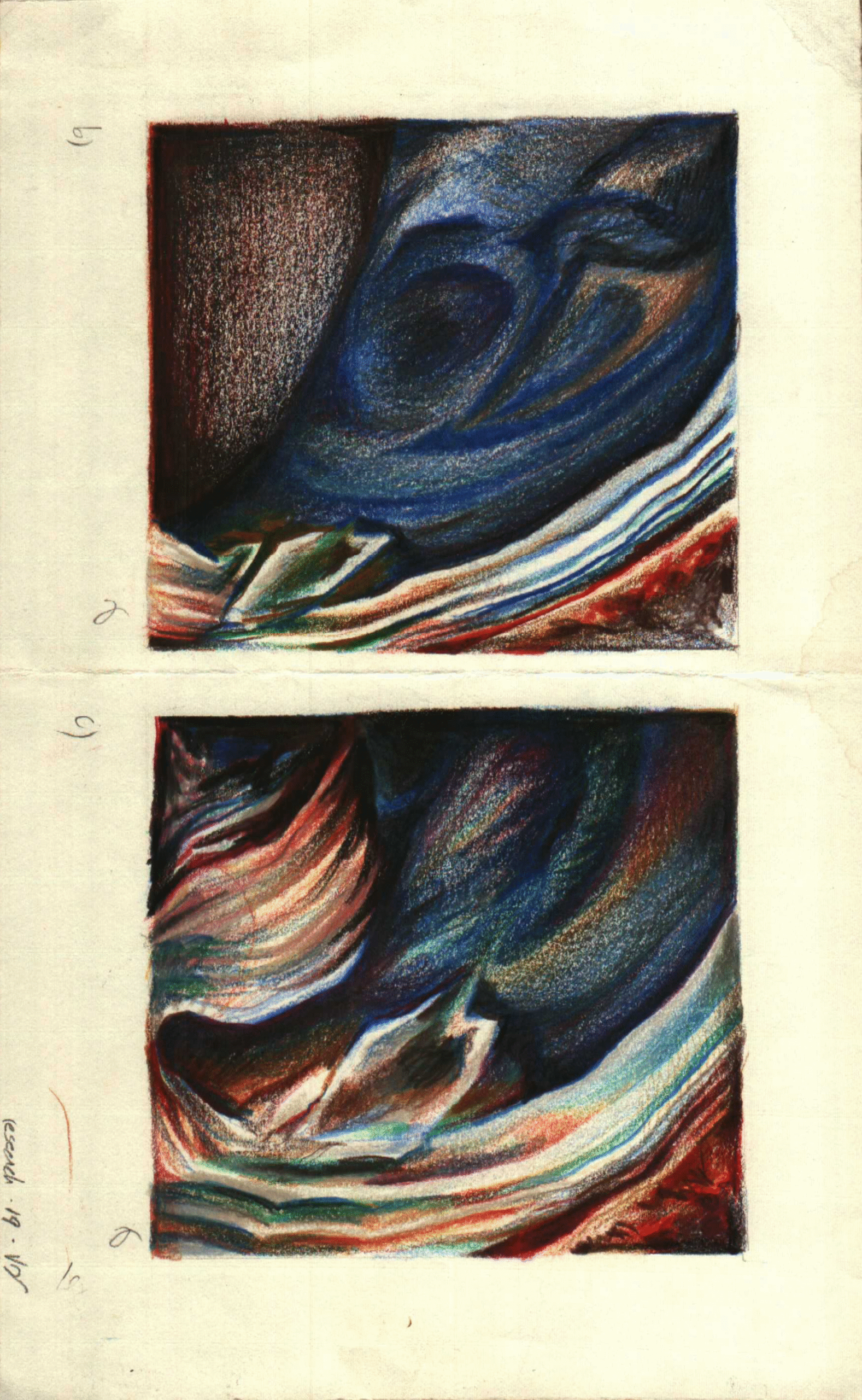
Below, one of the rare moments in which I use graphite pencil, a material I abhor. Following it, a board from a research project during university, focused on deconstruction and the technique of using colored pencil. It is not a material I abhor; I simply recognize the difficulty and patience required to use it in a way that its pigment can truly express the potential of the original idea. I worked with colored pencil intensely in 2016 and 2017, abandoning it almost entirely after those two years, replacing it with the technique of watercolor, as in the series “100 species of Brazilian fauna,” from 2020–2021.
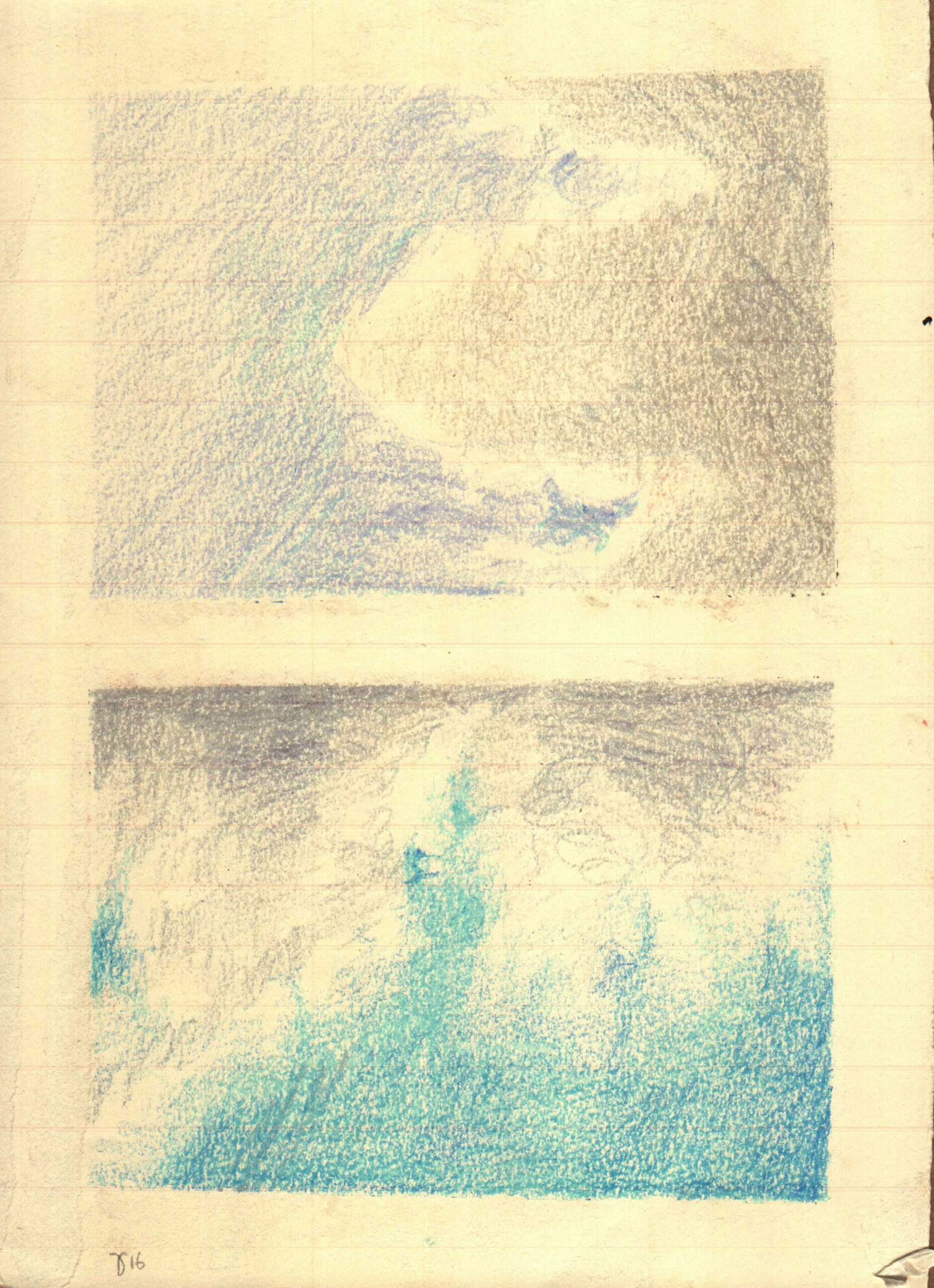
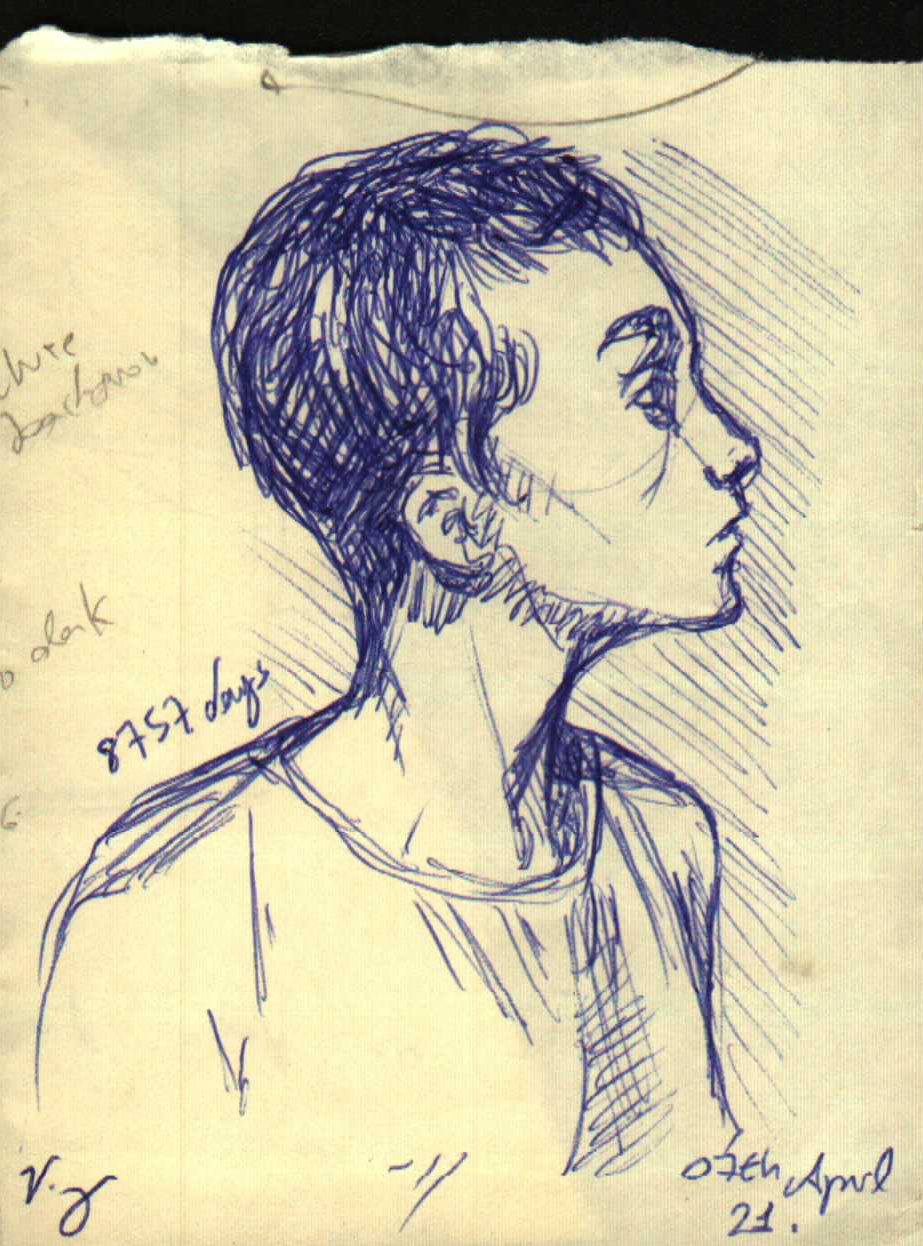
Finally, I extend the discussion so that one day I may bring a detailed text about drawing and painting, and I summarize this text by reiterating the importance of sketching and experimentation, as well as the habit and the ability to structure, at some level, a drawing within any pictorial form. Throughout my life, I have had friends, lovers, and books whose theme of daily drawing, or at least drawing with a stable frequency, was essential for the maturation of any artwork, especially when efficiency lies in the assured organicity of the final composition, when the lines dance confidently on whatever surface it may be, making the technical tension disappear and releasing the agency of the form itself (presented or represented). Finally, I end with a small sketch of the sky in pastel, also from the university years, and with my favorite material for making sketches and structures, which is the ballpoint pen, in a self‑portrait from 2021, a few days before my 24th birthday.
See you next time!
P.S.: I am working on an article about the importance of historical representation, while the importance of portraiture is reserved for a chapter of the next theoretical book.
______________________________________
Share this:

Would you like to receive the next post on your digital door?